Rolla – Real Fruit Roll-ups
Visual Identity, Typography, Art Direction, Tone of Voice
Rolla is a line of fruit leather – a healthier alternative to regular sugar-based roll-ups. Targeted at discerning young adults with an appreciation for the sweeter things in life, the brand’s tone is sensible, yet never mundane.
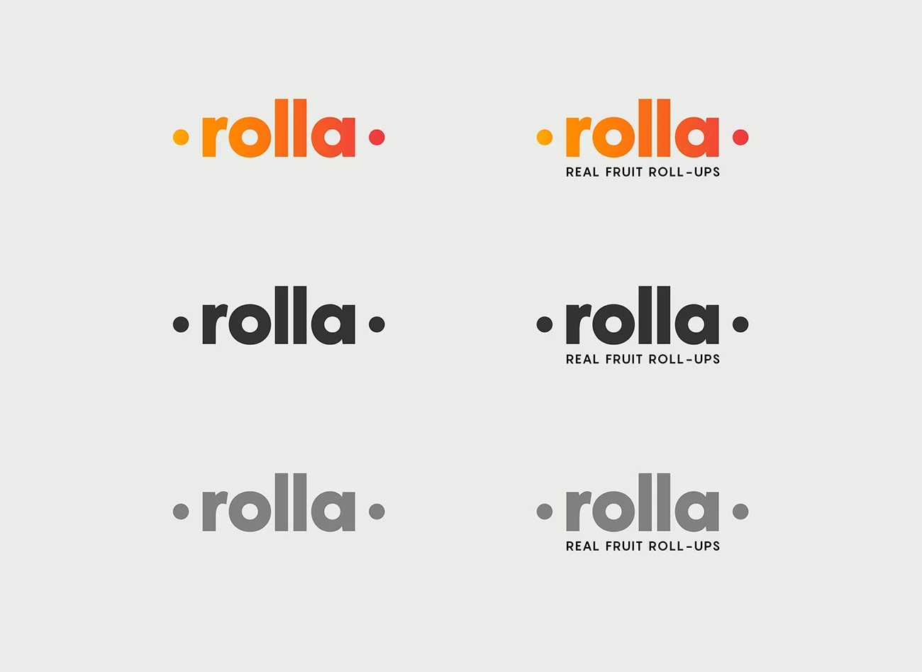
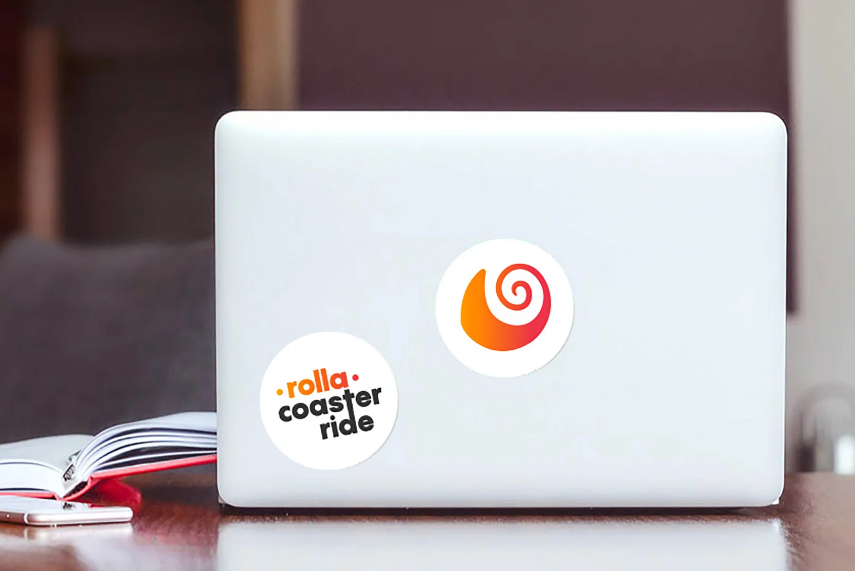
The name ‘Rolla’ is derived from the way the candy is presented – rolled. The typographic logo is crisp yet playful, embodying the brand’s modern and fun-loving spirit. A visual representation of the candy in its iconic, rolled up form is used as a secondary graphic. Meanwhile, the colour palette comes from the deep, bright hues of fruit such as mango, orange, and apple.
Playing on the brand name’s phonetic and visual similarity to the word ‘roll’, playful copy was generated for possible application on brand collateral (such as tote bags, pin badges, stickers, etc), emphasising the brand’s unique personality.
Rolla promises a guilt-free, rolla coaster ride.
*this is a self-initiated project


